Computers have become a vital part to consumers’ daily lives, and with the addition of smartphones, they are virtually impossible to escape. At the touch of a finger, you’re able to find locations, products, information and more, quickly making phones the go-to choice for searches. With that in mind, mobile must be an included platform in all aspects of your advertising and marketing plans using a mobile-first strategy.
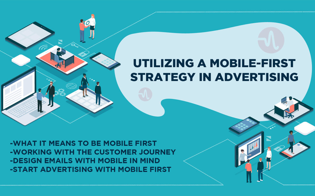
What it Means to be Mobile First
Moving to a mobile-first strategy essentially means your business devotes more time, energy, and resources towards considering how users are impacted by every aspect of your business on mobile devices. It’s a smart move considering the majority of searches are now performed on a mobile device. As of 2017, mobile conversions made up over 34% of e-commerce sales, which is expected to rise to 54% in 2021. While putting emphasis on mobile is the goal, it shouldn’t be the only platform you use. The key is to create a cohesive experience between mobile, desktop, and your physical location, as each aspect is still extremely valuable.
Working With the Customer Journey
Consumers have the opportunity to receive your message in so many different ways, from digital ads to print, TV, radio, websites, videos, in-person visits to the store, and more. Individuals may no longer follow the usual “purchase funnel” model that leads to a desired conversion, taking many routes to eventually get there, so it’s important to provide all customers a great experience throughout their diverse journeys.
Jumping around from mobile to desktop and in-store visits must be integrated seamlessly for the best customer experience. According to SmartBrief, two-thirds of consumers will begin the journey on their smartphone with 61% of them completing the purchase via desktop. As long as your website is mobile-friendly, you will encourage more customers to purchase from you and come back for more in the future. Given there is so much happening over several platforms, ensuring your website makes it a seamless process to jump from one to the other is essential.
Understanding where your customers are purchasing and searching from is also important. If they’re at home, they are 25% more likely to be making a purchase from their desktop, but if they are out and about, consumers are 20% more likely to make a spontaneous purchase from their mobile device. One idea would be creating an advertising message that can pinpoint specific users in a desired location to help grab their attention for that quick purchase decision will only help to improve your conversion rates.
Some will prefer visiting locations in-person, particularly if they would like to try on clothing or actually see what it looks like prior to purchasing. For those instances, your business should be prepared for customers to perhaps not buy right away, but have the ability to research anything in your store on your website, or easily find products online to go home and order.
Design Emails with Mobile in Mind
Gone are the days when users would need to wait to check emails until getting home to their desktops. Nowadays, 56% of email is opened using a mobile device, so if your email isn’t built to work properly, you’re doing your business a disservice. While there are many design aspects that go into creating a perfect email for the platform, there are a few simple rules to keep in mind to make it mobile-friendly:

- Keep emails below 102KB. Anything over that will be clipped by Gmail, offering users the option to download any remaining information. The problem with larger emails is that it may result in a tracking pixel being removed, providing you with inaccurate information, as well as turn customers away from your email with the request to download more. Furthermore, it could ultimately be flagged as spam, meaning customers won’t see it at all.
- Use single-column layouts. Having to resize pages and images on a mobile device isn’t particularly difficult, but for those on-the-go, having to do anything more than scroll will become an automatic turn off. Keeping the layout to a single column means it will be friendlier for one-handed navigation.
- Remember: Users are tapping, not clicking. Utilizing text that is too small or having too many links within close proximity makes it more likely users will make accidental clicks. Having to zoom in and aim the tip of a finger with exact precision leads to frustration and may turn customers away.
Start Advertising with Mobile First
If you’ve been advertising your business for some time, chances are you’re already utilizing mobile in some form or fashion, but it may be time to evaluate if you’re doing enough. Take a step back and review your marketing budget to determine if you’re allocating enough funds towards mobile. Ensure your advertising is reaching customers in the best way possible – and keeping your message clear across all platforms.
Our experienced team is ready to help you make the most of a mobile-first strategy. As an Amplified Digital client, we’ll help you navigate through the advertising world to achieve a great return on your investment, allowing you to concentrate on your business. Contact us today to discuss how we will help keep your business on the cutting edge of digital advertising strategy.
