This week I got to explore a little bit of my creative side for the first time in awhile. While pursuing a Communications degree, I am also in the process of completing a graphic design minor. It has been a semester since I had the opportunity to design and play around with layouts and it was nice to get back to that this week. My interest in design dates back to my high school years; I was a member of the yearbook staff for three years and was fortunate enough to serve as one of two editors-in-chief (EIC) my senior year. I decided to delve a little bit into my past this week for two reasons: 1) I ran into a former staffer of mine recently who had just finished serving as an EIC, and 2) I continue to see the similarities and differences from my design tendencies then and now.
Along with the world of responsibility of serving as an EIC came choosing a theme, developing a style and designing layouts. This was a huge stepping stone for me as it was an area of production where I did not possess any vast experience. I had served as a section editor twice before, so I was familiar with smaller design pieces like infographics and quote or story packages. This however resembled nothing similar to designing page layouts for a 300 page yearbook.
This type of design was somewhat comfortable for me as it was very structural. It was a matter of designing smaller packages and then designing templates that essentially functioned as bigger packages, for packages… It took us quite a while to determine what we wanted to do with the design. We had already locked in a theme–“Anything Can Happen”. We wanted this book to be about unexpected events and the way our students tackled them. With this theme came a very apprehensive yearbook adviser, fearful that we would start tossing all kinds of random, unexpected designs and pieces into this book. This would of course be followed by an enthusiastic “Anything Can Happen” in an effort to defend our flawed decision making process. In hindsight, I would say he liked to play on the conservative side of design and we definitely pushed his limits throughout the production of the book, but his emphasis on style and uniformity and our spontaneous mindset allowed the book to have a young and fun feel while still not getting out of hand and I am forever grateful for all that this adviser instilled in me. I no doubt would have had no clue communications was the field I wanted to go into without the opportunities I found in room 234 at Oakville Senior High.
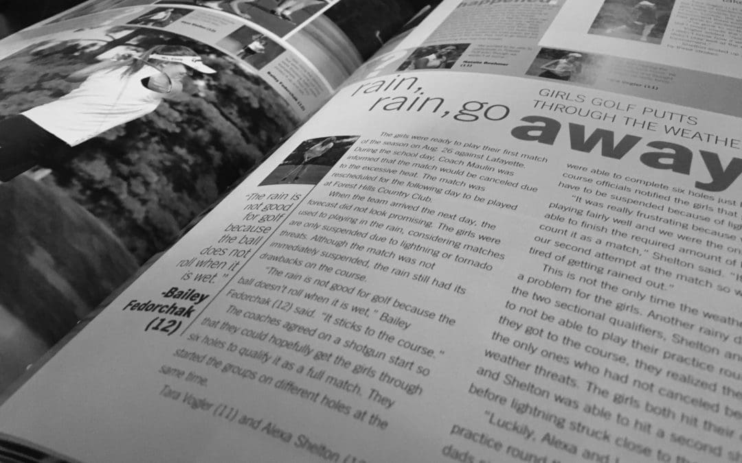
The nostalgia of running into this former staffer brought me back to my yearbook, and I started to notice my personal growth in my design, along with noticing all of the similarities from now and then and my personal tendencies. Design is all about thinking outside of the box; my problem is I have this subconscious fixation on boxes/bars. I am so structurally driven that anything involving lines, bars or boxes is my go to design element. Before you ask, of course bars were an essential part of design in the yearbook, thus presents my problem. I suppose a bar obsession is inevitable after working on a 300 page beast for a year where the central design element is a bar that spans the entire page. If you were to visit my personal portfolio website (http://alexashelton.weebly.com/), there is a brochure I made in a design class that features a mosaic of bars; it resembles something of an HGTV-esque kitchen backsplash with purple as the focal color. Stepping outside of this box is clearly proving difficult for me.
I will have you know that playing around with a few different designs this week, I did in fact incorporate some very nice circles into the flyers I designed which has been quite the hurdle overcome for me. Design is still new for me and I have yet to endure the meat and potatoes, if you will, of my graphic design minor so I know that it is okay that I have these hurdles to overcome. Hopefully implementing some elements that don’t possess four corners and edges is in my future, but for now a few circles seems like an accomplishment!